Showing posts with label Duncan's Creative Kitchens. Show all posts

Wednesday, September 19, 2012

Taking a Mt. Vernon Condo From Blah to Aaahhh

The once isolated kitchen is now part of the living space
When the owners of this Mt. Vernon condo in Bradenton began considering a new kitchen, they did their research. They looked online; watched HGTV; checked out the design magazines; and took a trip to the local home show – which is where I met them.


Before #1, from the living room
Before #2, the fridge
Before #3, the sink corner

Before #4, the range


Before #5, the bar
They were sick of the small, 70’s era kitchen they inherited when they bought the unit, and had definite ideas about what they wanted in their kitchen remodel: light finishes, a traditional look, plenty of storage, and a bigger feel. These folks also had an issue to work around: the tile floors continued through the entire house and couldn’t be matched – reusing the existing floor was essential to their tight budget.


The first design goal to tackle was a bigger feel. If you can’t match the tile floor, then you can’t remove walls. How do you make a kitchen bigger without removing walls? Our solution was two-fold: remove the old, dated, domed-ceiling, to free up another 12” in ceiling height; and greatly expand an existing pass thru to the dining area. 

Sliding the fridge allowed for a pantry. Can you see the patched the floor? Me neither.

Expanding the pass thru gave us an easy solution to another of the clients’ desires – a better breakfast bar. By wrapping the breakfast counter around a wasted corner, it not only gave them more eating space, but it visually increased the size of the kitchen without actually increasing its size. And with 12” more clearance in the kitchen ceiling, we were able to increase the height of the cabinets, thus adding thirty-three percent more storage by including another shelf in each.  More storage, bigger feel, same space – done!
Lazy Susan corner & hidden dishwasher (left)

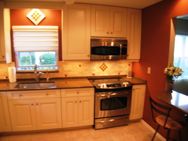
After looking at a variety of cabinetry options, the homeowners opted for the budget-friendly Venezia doorstyle in Buttermilk finish from UltraCraft Cabinetry. (Venezia is part of UltraCraft’s unique Vision Collection which utilizes Eurotek veneer, a micro-woodfiber technology that is combined with baked-on, industrial-grade, catalyzed-conversion varnish, giving the Vision Collection a color fast, durable finish.) The great part is that the Buttermilk finish comes with a Caramel patina. My clients received the look of a painted and glazed door - without any of the upgrade costs!

Dishwasher on the left made room for pots & pans storage near the range

We chose to pair the antique white cabinet finish with Sapporo countertops, an earthy brown quartz composite from Viatera. The new, open kitchen made the dark counter the focal point. The terra cotta accent seen in an otherwise light tumbled stone backsplash was the inspiration for the rust paint tones that really set off the creamy cabinets. Finishing the appliances with stainless steel brings an upscale cohesiveness to the entire room.

More breakfast bar means more counter space
All in all, I think we took care of the homeowners’ desires of a bigger, lighter, traditional space – what do you think?

Tuesday, March 6, 2012

Mind Games Make This Kitchen Grow


How many room-enlarging tricks can you see?
Once in a while, things just need to be freshened up. That’s exactly what these Perico Bay Club owners thought after living 13 years with the kitchen they inherited from the previous owner. No big remodeling project - just some practical tweaks and a cosmetic shift to match the taste and style they are drawn to. A big concern was the tiny feel of the condo kitchen – it needed to grow, but there was no real room to increase the space.

The 'before' shot #1
The dated 90’s-era cabinets were out, replaced with a warmer, more contemporary look that suited these full-time residents. In a compact kitchen, a lot of planning needs to go into the storage capabilities. Tweaking the sink configuration allowed for accessible storage in the corner, and deep drawers now accommodate pots and pans for easy retrieval.

The 'before' shot #2
Incorporating half of the existing laundry closet into the kitchen was the only real space we added. Their stacked laundry unit allowed us to simply reframe the existing closet and move the pantry storage into the kitchen proper.

Believe it or not, there are visual tricks when it comes to small spaces – take a look at the new slide-in range. Eliminating the bulky controls of the old model lightens up the cooking area and gives the appearance of more space. Black Whirlpool appliances (courtesy of Rice’s Appliances) nod more in the contemporary direction, even though one might think white appliances would make the space feel lighter.

Keeping the horizontal surfaces as light as possible will fool the eye into seeing a larger room. Luckily, we had a great tile floor that accomplished that illusion quite nicely. In turn, the lighter floor allowed the homeowner to add some warmth and dimension in her other finish choices. You can always afford to do darker finishes on the vertical surfaces of a small space, as long you keep the horizontal surfaces light.

Adding some height to the upper cabinets not only increased the usable storage space even further, but it accomplished another visual trick: pushing the ceiling farther away. Cabinetry taken to the ceiling gives the feel of a higher ceiling because your eyes will always stop at the top of the cabinets. If there’s space between the top of the cabinets and the ceiling, your brain registers that void as a lower ceiling. Taller cabinets = higher ceiling. Simple.

And how do you make the fridge seem smaller? By making the things around it bigger, of course. Creating a refrigerator alcove in matching cabinetry reduces the perceived mass of the appliance and adds needed storage space at the same time. Perfect: real and perceived benefits at the same time.

So the next time someone tells you that mind games aren’t a good thing, you’ll know better. You just need the right games.
The three S's: Style, Size, and Storage

Monday, March 5, 2012

Spa Treatment


Escape the pressures of the world
Work, kids, traffic, deadlines, in-laws, hassles. No matter what form it takes for you, everyone gets stressed out. If you’re like me, it happens a little too often. Vacations are great stress relievers, but with so much responsibility, how do you find the time to get away often enough?

Contemporary Getaway
The best solution is to create a private oasis just a few steps from your own bedroom. A soaking tub, relaxing music, soft lighting, and tranquil surroundings can work wonders on your mood in just a few minutes. The best part is you don’t have to make reservations! That was the motivation behind StarMark’s new line of Spa Vanities.

Country Retreat
No matter your tastes, you can customize this new line of vanities to suit your personal style. Elegant to Comfy; Urban to Traditional; the choices are yours. StarMark’s full line of doorstyles is at your disposal. Eleven different leg shapes empowers your individuality. And if you just can’t find what you are looking for in StarMark’s 600+ standard finishes, they are more than happy to finish your new spa vanity in any custom color you wish.

Fresh Aire
 And what’s a spa renovation without a little financial stress-reliever? Right now (and for a limited time), you can order StarMark’s line of Spa Vanities for 20% OFF their regular price! (Believe me, 20% OFF doesn’t come around often in the kitchen & bath business).

So start on the path to your own relaxing retreat. Call or e-mail us today. Peace and serenity awaits.

Friday, November 18, 2011

Returning Clients Create Retirement Dream


After living in their west Bradenton residence for a few decades, these homeowners felt that a simple kitchen update was not sufficient to keep them comfortable in their retirement – a major overhaul was in order. For years the kitchen seemed dark and cramped (even though it had white cabinets and a domed ceiling), and the foodie that lives here felt that there were several areas where functionality could be improved.

Before
Originally, they wanted to move a wall and steal some of the existing dining room space for a more spacious kitchen. Even though they routinely used the dining room and needed to accommodate a large table, they felt that was the only way to achieve what they wanted. Then they met with Scott Duncan. Since Duncan’s Creative Kitchens had assisted them with a bathroom  remodel just the year before, the clients knew what they were in for. 

Scott walked through the existing kitchen with the homeowners, asking about the good and bad aspects of the existing room. Being a foodie  himself, Scott was able to appreciate the need for better ergonomic flow as the homeowner would pass from food prep to cooking to cleanup. In the end, Scott was able to devise a plan that not only improved the space, but didn’t have to rob precious area from an already cramped dining room or spend money moving a wall which housed the plumbing (which would have added a couple thousand dollars to the final cost of the project).


Removing the dropped ceiling was a given, but the majority of improvements were accomplished by widening an existing doorway, pushing the fridge a little further into the adjacent family room, and creating an opening between the kitchen and the dining room. The space not only appeared larger, but enabled the clients to feel like they were present at their own parties (and not just the kitchen help). 

To keep with the rest of the house, a definite nod towards the traditional was achieved by using StarMark oak cabinetry in a warm tone (Oak Georgetown in a Honey with Chocolate glaze). An additional glazed finish really brings out the grain in the raised panel doors. The warm but light tones of the Tropical Breeze granite becomes a focal point as it travels up the wall behind the cooktop. Since no walls were moved, the existing tile floors were salvaged and allows the flow between rooms to continue unabated, augmenting the feeling of larger space.


To juxtapose the traditional air, cabinets were accented with frosted glass, and black appliances show a more contemporary flair. The addition of a wine chiller is but one of the special details these homeowners desired in an effort to achieve the functionality and ergonomic affect a foodie desires when he or she creates. 

Instead of moving that pesky wall, glass cabinetry was punched through, adding dimension & conversational ease in the kitchen – and a focal point for the dining room.

With a kitchen like this, retirement might be everything it’s cracked up to be after all.

Tuesday, September 20, 2011

A Funny Story - Stop Me If You’ve Heard This One Before


A landlord walks into a kitchen design showroom:

Landlord: Hey Scott, I’ve got great news. We have a tenant who wants that big empty space on the end.

Me: That’s fantastic!

Landlord: There’s only one problem – they want a lot more than the empty space. So we’ve decided to knock down half of the shopping center and rebuild it for the new tenant. Unfortunately, that means both you and your neighbors will have to find new homes. Oh, and we need you out by the end of October.

Me: *blink*

Isn’t that hilarious? I thought so - that’s why I laughed out loud when it happened a couple of weeks ago. Needless to say, I’ve had to readjust my priority list for the fall. Believe it or not, we are going back to the place we left a few years ago – Palma Sola Square (OK, it’s not the exact same location, but we’re in the same parking lot). It’s like going home again. We’ll be next to the Thai Cafe, a couple of doors east of SweetBay, and directly behind Starbucks (hope that’s enough name-dropping). 


It doesn’t look like much now, but it I’m hoping it will take shape pretty quickly (like, by October 31). So wish us luck, and I’ll keep you up to date on our progress. In the meantime, it’s still business as usual…

Monday, May 23, 2011

Simple Tune-up Creates Warm Simplicity in Bathroom


Warm and Cozy - a more inviting space for guests (after)
My recent clients were looking to bring their existing bathroom out of the 80’s. They had originally thought about removing everything and starting from scratch. But as our conversations evolved, I discovered that the only thing they were unhappy about was the dated vanity. The tub was in good condition; the tile on the walls was neutral; and the floor had only been down a short time. All this room really needed was a little warmth without much fuss.

Since we had completed their kitchen remodeling project just a year or two ago, I already had an idea of their tastes. Since this guest bath was just off of the family room (and in view of the kitchen), it made sense to continue the warm and simple feel of the kitchen into this space.

As you can see, honey colored maple cabinetry coupled with the brown and gold tones of the granite countertop play into the inviting cheerfulness of the existing shower tile. The fact that the perfect granite ended up being an inexpensive remnant was just a bonus!

Since it is a guest bath, a little visual interest was in order. Frosted glass softens the additional storage area and allows the upper cabinet to double as a medicine cabinet without displaying all of the homeowner’s personal details. Removing a door in the base and adding a couple of wicker baskets make towel storage both convenient and eye-catching.

Changing the faucets and light fixtures to an oil-rubbed bronze brings a feeling of completeness to the room that other metallic finishes might lack. And in a practical step, we decided it was a shame to dispose of a perfectly good mirror - so it was chopped in two, polished up, and reinstalled above each sink.

The cold, austere look of the 80's (before)
The big, cold emptiness of the original bathroom is now gone. By varying the heights of the vanity and bringing in warmer tones, we have been able to transform this space into a cozier, more inviting guest bath without breaking the bank. (If you’ll notice, we even kept the same paint on the walls). I think the only problem these homeowners will have now is convincing their guests to go home.

Monday, June 28, 2010

Now, Almost EVERYTHING is 10% OFF

No sooner had I posted an article about one cabinet company’s promotion, I’ll be darned if I didn’t get two more promotions that are just about the same. Now I can legitimately tell you that nearly every cabinetry option can be had for 10% OFF.

In addition to StarMark’s fantastic promotion, these manufacturers have jumped on the bandwagon as well:

UltraCraft Cabinets
10% OFF of all wood doorstyles
(July 1 thru September 31)


Designer's Choice and the
Presidential Collection’s
Great American
Red White and Blue Sale
10% off of all cabinetry orders - including thermofoil and closets
(June 28 thru July 31)


So if you've been thinking about any of these projects:
  • Kitchen
  • Bath
  • Closet
  • Home Office
  • Pantry
  • Home Entertainment Center
  • Hutch
  • Bedroom Built-ins
  • Laundry Room
  • Pet Center
  • Anything else involving cabinetry
 Just to show you that these cabinets cover almost the entire spectrum, take a look at the image below. Find the quality level you wish to be at, and then select the appropriate cabinet line.


Now is the time to do it. I've never seen a better time to buy cabinets. But you better hurry - these prices won't last forever! Contact Duncan's Creative Kitchens for more details.

Tuesday, June 22, 2010

StarMark’s 10% Off of Everything SALE

StarMark never ceases to amaze me. When we started with them 16 years ago, it was a simple, semi-custom cabinetry line. Since then, it has turned into a full-fledged custom operation that produces fine furniture quality cabinetry at semi-custom prices.

In the last couple of years, StarMark has introduced inset cabinetry doors, exotic veneer finishes, Old World style distressing, and now custom color matching.

Did I mention that all of this is available from a company that is still 20%-45% less than the other custom cabinet manufacturers?

Now they’ve done one better – from now until August 16, StarMark is taking 10% off of the entire cabinet line: all the doorstyles, accessories, finish upgrades, customization – everything! A straight 10% off – that’s totally unheard of in the kitchen design community.

By the time you finish adding up all the savings, there is no way another custom company can touch them. I’ve run the comparisons. With 10% off, StarMark competes with the price of my budget-conscious cabinetry offerings.

So kitchens, bathrooms, home offices, wet bars, you name it. If it’s StarMark Cabinetry, there’s 10% off in it for you. Talk about an affordable custom cabinet!

But you better hurry, when summer is over, so are the savings. Everything from StarMark is on Sale – but only until August 16. (contact Duncan's Creative Kitchens)

Saturday, October 10, 2009

Sell It In A Little While (3-7 Years)

Most people fall into this category. Even when you don’t have any plans to sell in this timeframe, if you aren’t sure about the length of time you’re going to own your home, these are the tips to follow.

Individualize, But Not Out of the Mainstream
You’re going to be there long enough to put your personal stamp on things, but you want to make sure that it’s not too ‘out there’. Make the permanent pieces (cabinets, counters, and floors) a nice neutral, then you can bring in blocks of color with paint and accessories.

Splurge Judiciously
It’s OK to go overboard on some things, but narrow it down to the 1 or 2 that you really want. Scale back on those things that are less important. So go ahead and get the Viking range, but maybe you don’t need the triple-upgrade, hand-carved onlays on every door.

Classic, Not Trendy
Stick with a timeless look, and stay away from the trends of the day. That way, if you decide to sell in three months or fifteen years, it will still look relevant.

Proper Lighting Is A Must!
Need I say more?

Move the Walls – If It Makes Sense
Be prudent with any structural changes. Although I’m always in favor of a larger kitchen, it doesn’t always make practical sense, and practicality is the key here.

It’s never easy to determine the correct decision when you are contemplating a remodeling project. But if you follow these simple recommendations, you’ll always know if you’re spending the proper amount, regardless of your situation.

Wednesday, September 16, 2009

Sell It Soon

It’s a question I get asked all the time, “How much should I worry about resale value while I’m remodeling my kitchen?” The truth is, there isn’t a single right answer for everyone. How long do you plan to live there? How extensive are your remodeling plans? Are your lifestyle needs different than the average homeowner? How important is the return on your remodeling investment?
If you were to narrow it down to one question, I think the most important has to do with the length of time you intend to own the home. For my clients, I break it down to 3 timeframes: Sell It Soon; Sell It In a Little While; Sell It Later (or Never).
This is the first of three sets of recommendation to make sure you maximize your remodeling experience…

Sell It Soon (<3years)
If you’re planning on putting your home on the market within the next 3 years, then return on investment should be near the top of your remodeling priorities. Even in this sluggish real estate market, if sold within 2 years, a homeowner should expect to realize between a 76%-79% return on investment for the Tampa Bay Market. To help you get the most bang for your buck, here are some tips:
Determine Your Target Market
Does your neighborhood cater to the young and hip or is it a more established and traditional area? Either way, you want to adjust your design style accordingly.
Focus on Aesthetics
Go for the most visual bang for your buck. If your budget doesn’t allow for both the all-wood cabinet and the fancy doorstyle, opt for the fancy doorstyle. Remember, looks count. Longevity doesn’t.

Code Beige
Even though you might be turned on by bold uses of color, homebuyers generally aren’t. Skip the color wheel and opt for light wood tones and neutral finishes (most homebuyers visualize better with a blank canvas).

Skip the Extras
His & Hers warming drawers, motorized spice racks, and built-in espresso machines might be just what you always wanted in your dream kitchen. But when it comes to resale value, you’ve just thrown a lot of money out the window. Stick with the basics – pick an appliance line that’s appropriate for your home (too entry-level can turn off a discriminating buyer; too luxurious is a waste of investment) and stick to the basic models. When in doubt, pick the stainless steel finish in a less-expensive line. For storage conveniences – no more than a few well-placed roll out trays and a lazy susan in the corner.
Minimize Structural Changes
Nothing eats up a kitchen budget faster than moving walls and all the mechanics that go with it. Don’t try to make all the design changes that have bugged you while you lived there. You’re not trying to solve your problems, you’re trying to sell your home. If you aren’t sure, ask a design professional if a structural change is a wise idea.

Follow the Trends
If you’re selling your home soon, it pays to follow the latest styles. Right now, simplistic is in – simple lines, warm tones, stone countertops, stainless steel appliances. The more current the kitchen looks, the more attractive it will be to potential buyers.


Proper Lighting is a Must!
Lighting is so often an afterthought, but it needs to be a priority for resale. A good lighting design can change the whole demeanor of a small kitchen. Plan it from the beginning.
Focus on the Negative
If your kitchen seems small, consider reducing the amount of cabinetry you have. Creating a focal point with negative space is not only visually pleasing, but it will cut down on your budget by reducing the amount of cabinetry you require.

If you follow these basic rules, you should end up with a kitchen that potential buyers love – at a price that won’t break your bank!

Tuesday, October 2, 2007

I've Got the Foodie In Me


Over the years, I have realized that the kitchen projects that give me the most satisfaction are the ones where I am working for other foodies. You know the types - individuals who get a thrill out of cooking and entertaining; someone who gets a little too excited because the new crop of heirloom tomatoes is at its peak; or your friend who salivates because they attended a cooking class and received 40% off an entire set of All-Clad cookware?

Well, that pretty much describes me too. (40% off of All-Clad?! Why can't I get that lucky?) I love trying out new recipes, finding the best restaurants, and am constantly on the lookout for the next gourmet shop. (Luckily, I have created a foodie out of my significant other as well. It works much better when you aren't fighting a McDonald's mentality) I just seem to get along quite well with clients who cook as much as I do. Besides an appreciation of cooking comes in handy when you are designing other peoples' kitchens.

I finally realized that I should bring all of these people together. I talked to a couple of folks, and we decided to form a cooking club - Get Together Gourmets. We thought we might have a dozen or so folks interested. Imagine our surprise when we had over 80 people say they wanted to be involved in our little cooking club - including a few trained chefs, and a couple of members of the local media. In fact, we had so much interest that we had to schedule a second organizational meeting. It's coming up on October 13, at Duncan's Creative Kitchens in Bradenton. If you are interested in registering, click here.

I'm really looking forward to what lies ahead for Get Together Gourmets. It's not often you get to mix work with this much pleasure.