Wednesday, September 26, 2012

Warming Up a Winter Retreat


A canal-front getaway gets a warm up

Not long after purchasing their Anna Maria Island getaway, the owners of this Holmes Beach project gave me a call because they felt the kitchen was in the need of some attention.

The Before: dated, nondescript, and cold
I worked with these clients previously. Actually, I have worked with them frequently: On separate occasions, we remodeled a kitchen, two bathrooms, and a wet bar in their previous home; we also remodeled the kitchen in their parents’ home. You get to know a person after 4 or 5 projects, so discovering what she wanted out of this new remodeling project was much simpler. The kitchen was dated, nondescript, and cold.

Since this was going to be a retreat not only for the owners, but also a vacation getaway for family and friends, the goal was to warm it up, give it some character, and bring it into the present. Everything in the previous projects were done in a heavy, traditional look (it went with that particular home). My client still liked that look, but we agreed that a canal-front home needed to be a little brighter and more transitional – but still with a firm foot in the traditional.

We anchored our palette with a warm cherry cabinet from UltraCraft in an Amber finish. The Dennison doorstyle has a contemporary design, and adding the cherry finish really warms it up. The other traditional aspect was a granite countertop – there really was no other option as far as the homeowner was concerned (what can I say? She likes granite).
Proper lighting and stainless steel appliances play against the warm cherry cabinets

The cherry cabinets and granite counters gave us the traditional part of our Transitional feel – now we had to weave in the contemporary components. Stainless steel was the desired finish for the free-standing appliances and a mixed media backsplash of glass and stone was the perfect backdrop for the more traditional granite surface. Taking elements of two different styles and blending them together can really produce a nice result when it’s done correctly.

Mixed media back splash of glass and stone with under cabinet lighting
The lack of natural lighting was tackled with a two-pronged attack: we kept the horizontal surfaces very light (and very neutral) by selecting a granite in Kashmir Gold and a porcelain tile that picked up the subtle earthy tones evident in the granite; we also strategically planned the lighting design to provide both functionality (with under cabinet works lights) and ambiance (with display lights behind upper glass doors). After dinner, the display lights can be lit to provide an appealing backdrop for after-dinner conversation from the adjacent dining area.

These repeat clients couldn’t be more pleased with the outcome. I’m just sorry we don’t have any other rooms that are ripe for additional projects. Then again - when I left, they were starting to talk about an outdoor kitchen…

Wednesday, September 19, 2012

Taking a Mt. Vernon Condo From Blah to Aaahhh

The once isolated kitchen is now part of the living space
When the owners of this Mt. Vernon condo in Bradenton began considering a new kitchen, they did their research. They looked online; watched HGTV; checked out the design magazines; and took a trip to the local home show – which is where I met them.


Before #1, from the living room
Before #2, the fridge
Before #3, the sink corner

Before #4, the range


Before #5, the bar
They were sick of the small, 70’s era kitchen they inherited when they bought the unit, and had definite ideas about what they wanted in their kitchen remodel: light finishes, a traditional look, plenty of storage, and a bigger feel. These folks also had an issue to work around: the tile floors continued through the entire house and couldn’t be matched – reusing the existing floor was essential to their tight budget.


The first design goal to tackle was a bigger feel. If you can’t match the tile floor, then you can’t remove walls. How do you make a kitchen bigger without removing walls? Our solution was two-fold: remove the old, dated, domed-ceiling, to free up another 12” in ceiling height; and greatly expand an existing pass thru to the dining area. 

Sliding the fridge allowed for a pantry. Can you see the patched the floor? Me neither.

Expanding the pass thru gave us an easy solution to another of the clients’ desires – a better breakfast bar. By wrapping the breakfast counter around a wasted corner, it not only gave them more eating space, but it visually increased the size of the kitchen without actually increasing its size. And with 12” more clearance in the kitchen ceiling, we were able to increase the height of the cabinets, thus adding thirty-three percent more storage by including another shelf in each.  More storage, bigger feel, same space – done!
Lazy Susan corner & hidden dishwasher (left)

After looking at a variety of cabinetry options, the homeowners opted for the budget-friendly Venezia doorstyle in Buttermilk finish from UltraCraft Cabinetry. (Venezia is part of UltraCraft’s unique Vision Collection which utilizes Eurotek veneer, a micro-woodfiber technology that is combined with baked-on, industrial-grade, catalyzed-conversion varnish, giving the Vision Collection a color fast, durable finish.) The great part is that the Buttermilk finish comes with a Caramel patina. My clients received the look of a painted and glazed door - without any of the upgrade costs!

Dishwasher on the left made room for pots & pans storage near the range

We chose to pair the antique white cabinet finish with Sapporo countertops, an earthy brown quartz composite from Viatera. The new, open kitchen made the dark counter the focal point. The terra cotta accent seen in an otherwise light tumbled stone backsplash was the inspiration for the rust paint tones that really set off the creamy cabinets. Finishing the appliances with stainless steel brings an upscale cohesiveness to the entire room.

More breakfast bar means more counter space
All in all, I think we took care of the homeowners’ desires of a bigger, lighter, traditional space – what do you think?

Friday, May 11, 2012

Thanks for 25 Years!


25 years in business is a long time. There are days that go by so fast, and other ones that seem like they’ll never end. In the end, it is all worth it when we can make someone’s dreams come true.

We’re going to spend the rest of the year celebrating our Silver Anniversary, and hope you’ll be a part of it. Thank you for the work you’ve given us, the referrals you’ve trusted to us, and pleasure of your company.

Now, I’ve got to start working on the next 25 years…

Tuesday, March 6, 2012

Mind Games Make This Kitchen Grow


How many room-enlarging tricks can you see?
Once in a while, things just need to be freshened up. That’s exactly what these Perico Bay Club owners thought after living 13 years with the kitchen they inherited from the previous owner. No big remodeling project - just some practical tweaks and a cosmetic shift to match the taste and style they are drawn to. A big concern was the tiny feel of the condo kitchen – it needed to grow, but there was no real room to increase the space.

The 'before' shot #1
The dated 90’s-era cabinets were out, replaced with a warmer, more contemporary look that suited these full-time residents. In a compact kitchen, a lot of planning needs to go into the storage capabilities. Tweaking the sink configuration allowed for accessible storage in the corner, and deep drawers now accommodate pots and pans for easy retrieval.

The 'before' shot #2
Incorporating half of the existing laundry closet into the kitchen was the only real space we added. Their stacked laundry unit allowed us to simply reframe the existing closet and move the pantry storage into the kitchen proper.

Believe it or not, there are visual tricks when it comes to small spaces – take a look at the new slide-in range. Eliminating the bulky controls of the old model lightens up the cooking area and gives the appearance of more space. Black Whirlpool appliances (courtesy of Rice’s Appliances) nod more in the contemporary direction, even though one might think white appliances would make the space feel lighter.

Keeping the horizontal surfaces as light as possible will fool the eye into seeing a larger room. Luckily, we had a great tile floor that accomplished that illusion quite nicely. In turn, the lighter floor allowed the homeowner to add some warmth and dimension in her other finish choices. You can always afford to do darker finishes on the vertical surfaces of a small space, as long you keep the horizontal surfaces light.

Adding some height to the upper cabinets not only increased the usable storage space even further, but it accomplished another visual trick: pushing the ceiling farther away. Cabinetry taken to the ceiling gives the feel of a higher ceiling because your eyes will always stop at the top of the cabinets. If there’s space between the top of the cabinets and the ceiling, your brain registers that void as a lower ceiling. Taller cabinets = higher ceiling. Simple.

And how do you make the fridge seem smaller? By making the things around it bigger, of course. Creating a refrigerator alcove in matching cabinetry reduces the perceived mass of the appliance and adds needed storage space at the same time. Perfect: real and perceived benefits at the same time.

So the next time someone tells you that mind games aren’t a good thing, you’ll know better. You just need the right games.
The three S's: Style, Size, and Storage

Monday, March 5, 2012

Spa Treatment


Escape the pressures of the world
Work, kids, traffic, deadlines, in-laws, hassles. No matter what form it takes for you, everyone gets stressed out. If you’re like me, it happens a little too often. Vacations are great stress relievers, but with so much responsibility, how do you find the time to get away often enough?

Contemporary Getaway
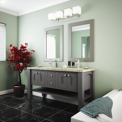
The best solution is to create a private oasis just a few steps from your own bedroom. A soaking tub, relaxing music, soft lighting, and tranquil surroundings can work wonders on your mood in just a few minutes. The best part is you don’t have to make reservations! That was the motivation behind StarMark’s new line of Spa Vanities.

Country Retreat
No matter your tastes, you can customize this new line of vanities to suit your personal style. Elegant to Comfy; Urban to Traditional; the choices are yours. StarMark’s full line of doorstyles is at your disposal. Eleven different leg shapes empowers your individuality. And if you just can’t find what you are looking for in StarMark’s 600+ standard finishes, they are more than happy to finish your new spa vanity in any custom color you wish.

Fresh Aire
 And what’s a spa renovation without a little financial stress-reliever? Right now (and for a limited time), you can order StarMark’s line of Spa Vanities for 20% OFF their regular price! (Believe me, 20% OFF doesn’t come around often in the kitchen & bath business).

So start on the path to your own relaxing retreat. Call or e-mail us today. Peace and serenity awaits.