Friday, November 18, 2011

Returning Clients Create Retirement Dream


After living in their west Bradenton residence for a few decades, these homeowners felt that a simple kitchen update was not sufficient to keep them comfortable in their retirement – a major overhaul was in order. For years the kitchen seemed dark and cramped (even though it had white cabinets and a domed ceiling), and the foodie that lives here felt that there were several areas where functionality could be improved.

Before
Originally, they wanted to move a wall and steal some of the existing dining room space for a more spacious kitchen. Even though they routinely used the dining room and needed to accommodate a large table, they felt that was the only way to achieve what they wanted. Then they met with Scott Duncan. Since Duncan’s Creative Kitchens had assisted them with a bathroom  remodel just the year before, the clients knew what they were in for. 

Scott walked through the existing kitchen with the homeowners, asking about the good and bad aspects of the existing room. Being a foodie  himself, Scott was able to appreciate the need for better ergonomic flow as the homeowner would pass from food prep to cooking to cleanup. In the end, Scott was able to devise a plan that not only improved the space, but didn’t have to rob precious area from an already cramped dining room or spend money moving a wall which housed the plumbing (which would have added a couple thousand dollars to the final cost of the project).


Removing the dropped ceiling was a given, but the majority of improvements were accomplished by widening an existing doorway, pushing the fridge a little further into the adjacent family room, and creating an opening between the kitchen and the dining room. The space not only appeared larger, but enabled the clients to feel like they were present at their own parties (and not just the kitchen help). 

To keep with the rest of the house, a definite nod towards the traditional was achieved by using StarMark oak cabinetry in a warm tone (Oak Georgetown in a Honey with Chocolate glaze). An additional glazed finish really brings out the grain in the raised panel doors. The warm but light tones of the Tropical Breeze granite becomes a focal point as it travels up the wall behind the cooktop. Since no walls were moved, the existing tile floors were salvaged and allows the flow between rooms to continue unabated, augmenting the feeling of larger space.


To juxtapose the traditional air, cabinets were accented with frosted glass, and black appliances show a more contemporary flair. The addition of a wine chiller is but one of the special details these homeowners desired in an effort to achieve the functionality and ergonomic affect a foodie desires when he or she creates. 

Instead of moving that pesky wall, glass cabinetry was punched through, adding dimension & conversational ease in the kitchen – and a focal point for the dining room.

With a kitchen like this, retirement might be everything it’s cracked up to be after all.

Saturday, September 24, 2011

Easy Toilet Rebate


Did you know that Manatee County has a program that will give you up to $100?

All you have to do is change out your high volume toilet that flushes 3.5 gallons with an Ultra Low Flow Toilet that uses 1.6 gallons (or less) per flush. If you’re home was built in 1992 or before, you may be eligible. You can even receive the rebate on two toilets in your home if you qualify.

If you are a customer of Manatee County Water, then you can contact them to find out more information. Give them a call at 1-800-964-2140 or email them at: MCRebates77@yahoo.com

Everyone can use a hundred bucks, right?

Tuesday, September 20, 2011

A Funny Story - Stop Me If You’ve Heard This One Before


A landlord walks into a kitchen design showroom:

Landlord: Hey Scott, I’ve got great news. We have a tenant who wants that big empty space on the end.

Me: That’s fantastic!

Landlord: There’s only one problem – they want a lot more than the empty space. So we’ve decided to knock down half of the shopping center and rebuild it for the new tenant. Unfortunately, that means both you and your neighbors will have to find new homes. Oh, and we need you out by the end of October.

Me: *blink*

Isn’t that hilarious? I thought so - that’s why I laughed out loud when it happened a couple of weeks ago. Needless to say, I’ve had to readjust my priority list for the fall. Believe it or not, we are going back to the place we left a few years ago – Palma Sola Square (OK, it’s not the exact same location, but we’re in the same parking lot). It’s like going home again. We’ll be next to the Thai Cafe, a couple of doors east of SweetBay, and directly behind Starbucks (hope that’s enough name-dropping). 


It doesn’t look like much now, but it I’m hoping it will take shape pretty quickly (like, by October 31). So wish us luck, and I’ll keep you up to date on our progress. In the meantime, it’s still business as usual…

Monday, May 23, 2011

Simple Tune-up Creates Warm Simplicity in Bathroom


Warm and Cozy - a more inviting space for guests (after)
My recent clients were looking to bring their existing bathroom out of the 80’s. They had originally thought about removing everything and starting from scratch. But as our conversations evolved, I discovered that the only thing they were unhappy about was the dated vanity. The tub was in good condition; the tile on the walls was neutral; and the floor had only been down a short time. All this room really needed was a little warmth without much fuss.

Since we had completed their kitchen remodeling project just a year or two ago, I already had an idea of their tastes. Since this guest bath was just off of the family room (and in view of the kitchen), it made sense to continue the warm and simple feel of the kitchen into this space.

As you can see, honey colored maple cabinetry coupled with the brown and gold tones of the granite countertop play into the inviting cheerfulness of the existing shower tile. The fact that the perfect granite ended up being an inexpensive remnant was just a bonus!

Since it is a guest bath, a little visual interest was in order. Frosted glass softens the additional storage area and allows the upper cabinet to double as a medicine cabinet without displaying all of the homeowner’s personal details. Removing a door in the base and adding a couple of wicker baskets make towel storage both convenient and eye-catching.

Changing the faucets and light fixtures to an oil-rubbed bronze brings a feeling of completeness to the room that other metallic finishes might lack. And in a practical step, we decided it was a shame to dispose of a perfectly good mirror - so it was chopped in two, polished up, and reinstalled above each sink.

The cold, austere look of the 80's (before)
The big, cold emptiness of the original bathroom is now gone. By varying the heights of the vanity and bringing in warmer tones, we have been able to transform this space into a cozier, more inviting guest bath without breaking the bank. (If you’ll notice, we even kept the same paint on the walls). I think the only problem these homeowners will have now is convincing their guests to go home.

Tuesday, May 3, 2011

6 Elements of a Pretty Powder Room

How to Go Whole-Hog When Designing Your Half-Bath  

by vanessa_brunner at houzz.com

The term "powder room" makes me giggle a bit. There's something so old-fashioned sounding about it, you know? In reality, the modern day powder room is nothing more than a small half-bath, usually on the main floor of a home, with a toilet, sink, and mirror. Although it's usually the smallest room in the house, it also tends to be one of the most-used rooms, so every bit of its space is extremely valuable. But a smaller size means easier and less expensive renovations, so have fun with it! Stay aware of each individual feature in the room, and how it works with every other aspect—little changes can have an immense impact. Here are six elements to consider when vamping up your powder room:
1. Organization. Since you're working with a small space, you want to make sure that each and every square foot is used in the best possible way. This powder room is extremely long and narrow, but it totally works. It may not have originally meant for a bathroom, but the slim vanity set fills up the wall enough so the length doesn't feel awkward, and each bit of space is used efficiently. And the way the floor mirrors the stained glass window adds a unique polish to the room.
Observe the shape and dimensions of your powder room when you walk in. What is going to make the most sense, spatially and practically? If your powder room is rectangular (like most), consider using one of the longer walls for the sink set — or two if you can make it work! The symmetry and added functionality of the double sinks in this powder room is absolutely perfect.
This hidden powder room is adorable and functional. Since it's right next to the kitchen and living areas of the home, it's ideal that design flows well with the rest of the house. And I like how it manages to make use of the slanted ceiling by placing the toilet in the far corner, and putting a compact vanity towards the front of the space, leaving plenty of room to move around.

2. Fresh and bold walls. Modern powder rooms are all about drama. Vivid wallpapers, strong colors, and bright tiles all help mold the room into something exciting that won't be missed, despite its size. This graphic floral wallpaper is striking but clean in black and white, and it provides a great contrast with the polished wood vanity.

A darker paint or wallpaper combination can make a powder room feel intimate and cozy — it's the ideal place to experiment with the way darker colors reflect light. This gray and green combination creates a flattering glow when combined with the ceiling light and natural light from the window.

Tile is another great option for a powder room wall. It's easy to clean, lasts forever, and adds a surprising touch of flair when used in a bright color. It's definitely an investment — of both time and money — so it might not be the best idea if you're looking for a cheap and quick fix. (Side note: this vanity is amazing.)

3. A space-conservative sink. When it comes to your sink, you want to choose something that's chic, functional, and is the same style as the rest of the room — as well as the rest of your house. But because powder rooms are usually so small, space should be your primary concern. Choosing a wall-mounted or pedestal sink provides more space, but can be difficult because it doesn't provide the same amount of storage as a standard vanity.

This powder room has a wall mounted sink that is classic in structure — which works well with the wallpaper and mirror — with simple metal towel racks underneath for a bit of added storage. Shelving hidden behind a mirror would be another great option here.

This pedestal sink is an excellent in this tiled powder room, but offers very little counter space for soap, towels, and other guest amenities. The simple metal side table is the perfect solution. Its height makes it feel tucked out of the way, but still convenient for guests to access towels, soaps and lotion.

Vessel sinks (sinks that sit on top of a counter) are a design element unto themselves — even the most basic designs stand out. Sinks that are so strong in design tend to work well in powder rooms that are a bit more muted in style. They can restrict counter space though, so a shelving element hidden behind a mirror, or even a small rolling caddy might be necessary.

4. Lighting that flatters. Let's be honest, there's a reason they call it the powder room: It's where we ladies (and gents) go to powder our noses, check for food in our teeth, and fluff up our hair. You want guests to feel beautiful after coming out of your powder room, and lighting is a huge part of that. While you want it to be flattering and not fluorescent, you also don't want the room to be under-lit. Choosing a light fixture that gives off a lot of light and installing a dimmer on it can be a good compromise. A fixture placed over the mirror is great for touching up makeup, but unless you want guests to get a good look at every pore on their noses, try to implement a softer glow.

A lot of designers and homeowners opt for sconces in powder rooms. It's a bit more of a traditional approach, but it allows you to play around with different styles of lighting fixtures. This shell chandelier sconce has the same touch of eclectic femininity as the wallpaper.

These metal hanging lights are definitely dramatic, and the patterns of light they give off actually are a wonderful design element in the room. If you want to go for a similar look, just keep in mind that these types of lights don't usually work well when you're re-applying eyeliner, so adding an additional ceiling light could be helpful.

5. A fun mirror. Like every other element in this room, you want the mirror to be strong and stand out. Be careful of placement too! The mirror in this room is beautiful, but it might be a bit high for shorter folks to give themselves a once-over.

The frame of this mirror is so fun — it contrasts well with the wallpaper, but still matches the sink and towel color. I would prefer it a little bigger. As-is, it makes the room feel a bit smaller, and isn't really practical for someone who needs to get a good look at herself.

If used right, a mirror can actually help a powder room feel larger. Having an entire wall of mirrors behind the sink not only allows for a close-up and a full-length look, but it gives the illusion that the room has much more space and light than a smaller framed mirror.

If you want to avoid a potentially messy and more expensive installation, then stick with a framed mirror, but try to get one that allows for a full upper body view. This mirror is just right! It's not too small in size, and placed at a good height for short and tall guests. It also has an adorable frame that adds to the quirky cottage style of this powder room.
6. Distinct hardware. Hardware is the jewelry of the powder room. You want to pick hardware that's consistent with your style, but don't be afraid to choose something that will stand out. This sink fixture is relatively simple and modern; its placement is what catches the eye.

The mosaic lining this sink is a great touch. It maintains the same neutral tones as the granite counter, but also has a bit of copper reflecting in it to match the sink fixtures. The combination of these elements is one of those unique accents that make a powder room fun.

Want that little extra something to really pull your powder room together? Match all your hardware: sink fixtures, toilet paper roll holder, and yup, even the toilet handle. It's one of those easy touches that makes a surprising difference in the room.

Tuesday, April 19, 2011

Add Another Closet – Without Adding a Closet


Her Side
Ever wish you had more closets? Is there ever enough closet storage, no matter where you live?  I rarely come across people who have too much.

His Side
My latest clients were having the same dilemma – their condo just didn’t have enough closet space to house everything. The walk-in closet in their master bedroom had become like the Bermuda Triangle – things went in and were never seen again. The problem? Their closet was set up with a single hanger rod with one shelf above it – all the way around the room. It was a nice sized closet (about 5 feet by 7 feet), but it wasn’t being used to its fullest potential.

Believe it or not, we were able to more than double the storage capacity of the closet, customize the storage to the homeowners’ needs, and do it all for about $2,000.

The biggest problem – not enough shelf space. My clients preferred to fold much of their clothing, and a single wire shelf around the top of the room just wasn’t cutting it. They didn’t have many long things that needed to hang, but an abundance of shirts and slacks were eating up what little hanging space was available to them. 


By taking advantage of the unused space of the existing walls, we added 120% more storage than they had started with! All without adding any square footage to the closet! Seriously – the closest thing we got to actual construction was adding a coat of paint to the walls. Everything else was accomplished by adapting the storage capabilities to our clients’ needs.

It isn’t often that a closet turns out nice enough to photograph, but I had add this one to the album.

As you can see, each person has his or her own side for hanging clothes, ample shelf storage for folded items, plus extra space on the connecting wall. They even have room to go shopping for more!

So next time you think you’re running out of space, take a minute to take a gander at your existing closets. You may be able to save the cost of adding on to your home – and still add a closet.

Thursday, April 14, 2011

Kitchen and Bath Trends

The 2010 Master Design Awards' Kitchen and Bath Category Winners Share the Latest Homeowner Desires 
Today’s homeowners are more adamant than ever about what they want to incorporate into a remodeling project. The winners of Qualified Remodeler’s 2010 Master Design Awards in the kitchen and bath categories largely agree educating clients about what works and what doesn’t work is one of the many challenges facing remodelers.

Another challenge of homeowners’ I-want-what-I-want attitudes is they expect to stay in their homes indefinitely and seem less attuned to the impact of alterations on resale values, a contradiction to the return-on-investment remodeling theory.

Regardless, changes in consumer attitudes, including a heightened concern with getting more for less money, make the remodeler’s task as a consultant and his or her ability to tactfully compromise even more crucial today.

The Art of Compromise

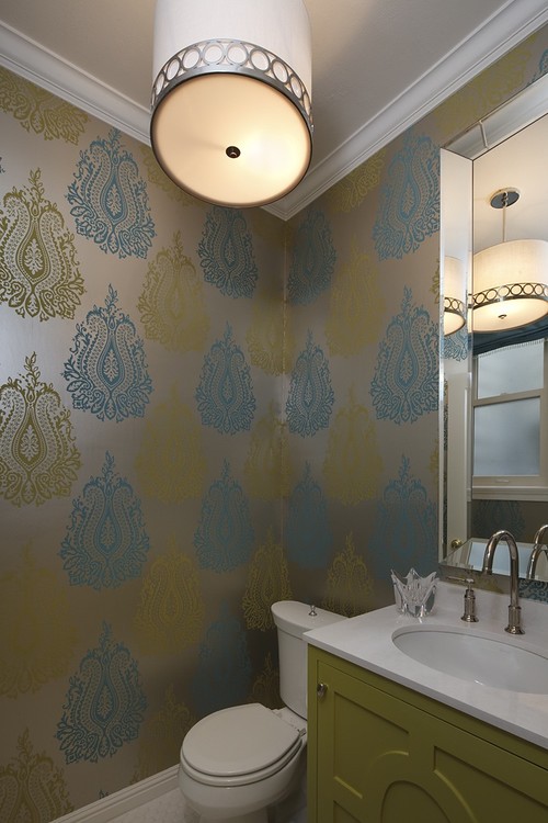
Laura Orfield-Skrivseth, co-owner and designer/project manager with Orfield Design & Construction Inc., Minnetonka, Minn., particularly relied on her team’s ability to compromise in their project that won Silver in the 2010 Master Design Awards’ Kitchens Below $50,000 category.

The homeowners approached Orfield-Skrivseth with a color palette of bright blue and bright yellow. They wanted a cottage-style kitchen and were against installing a dishwasher. Orfield-Skrivseth and Amy Hinck, another design/project manager at the firm, found a way to work these ideas into the project without compromising future homeowners’ ability to have a dishwasher. “We were able to tone down the homeowners’ original colors and choose higher-end countertops while giving her the bold accents she wanted,” Orfield-Skrivseth notes. “The couple was very strict about not wanting a dishwasher, but we put in a rolling cart so a future owner can easily put a dishwasher in.”

Most of the kitchen and bath category winners said they find compromises to give clients what they want without being detrimental to future homeowners’ comfort. Will Cole, owner of Design Destinations Inc., Houston, says: “There are times when the homeowner will have a ‘me’ attitude. That’s when we’ll provide guidance about the issues they’ll have if we build it according to their ideas. For example, we have a client who wants us to build a bathroom onto the backside of his kitchen while turning the existing hall bath into a laundry room. The hall bath services the three bedrooms, so I mentioned to him that it will be highly undesirable to have the kids walk through the kitchen to take a bath. We’re now looking at different ways we can get the bathroom into the existing floor plan.”

“We’ve been fortunate that our clients are not interested in a quick sale and, therefore, we’re not in business to flip homes,” says Greg Kraus, a designer with Otogawa-Anschel Design-Build LLC, Minneapolis. “However, we try to include the infrastructure for future needs whether that is roughed-in plumbing lines or chase ways for electrical updates.”

Connections to Existing Architecture

Despite wanting their own tastes integrated into their remodels, homeowners still are sensitive to connecting a new design with their home’s existing architecture. Tatiana Machado-Rosas, senior designer/design department head with Jackson Design & Remodeling, San Diego, received an Honorable Mention in the Kitchens Over $100,000 category for a renovation/addition to a home listed on the San Diego Historical Registry. The 10,000-square-foot house, which was built in the early 1900s, had a 150-square-foot kitchen that didn’t correlate in scale or character to the rest of the home. The homeowners wanted modern conveniences, but they didn’t want to compromise the home’s design integrity.

“I think people are paying a little more attention to the architecture of their homes,” she says. “Even in extensive remodels the design is cohesive between the inside and outside. Sometimes they have an idea of what style they want but they want to be sure the style will fit the house.”

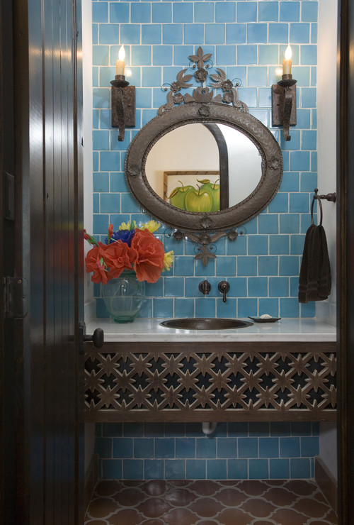
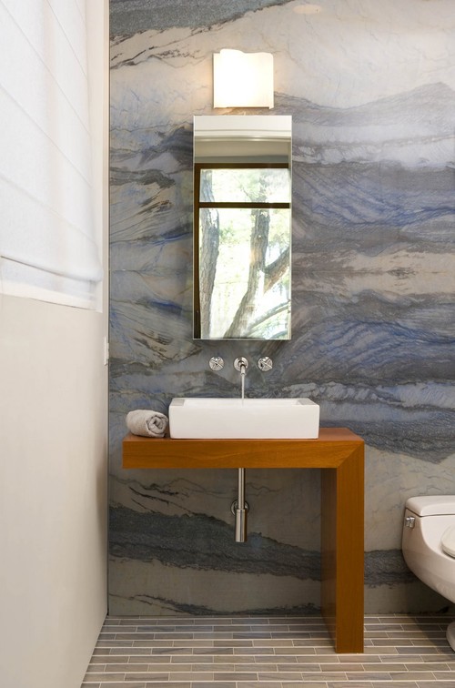
Richard Bubnowski, owner of Richard Bubnowski Design LLC, Point Pleasant Beach, N.J., won Gold in the Bathrooms From $30,000 to $50,000 category for a project in which the homeowners were sensitive to their beach house’s early 20th century Shingle-style architecture. “A lot of the work we do is more transitional—something that ties in with the traditional architecture of the existing home but at the same time is considerably more modern but not cutting-edge modern,” Bubnowski notes.

The homeowners asked Bubnowski to redesign their tiny bathroom to meet their needs. The house is used during the summer months, which meant the homeowners only wanted a shower because it was more practical and space was limited. “I think it is kind of an urban myth that you need a bathtub somewhere in a house,” Bubnowski says. “Many of our clients don’t want it because they simply don’t have the time.”
Bubnowski said the beach-house owners didn’t want him to expand the bathroom by moving into adjacent rooms or adding outward, so he decided to go up into the attic space, raising a 7 1/2-foot ceiling to 9 1/2 feet and adding clerestory windows that are reminiscent of the home’s existing architecture. Bubnowski integrated the beach by specifying glass tile in a shade similar to sea glass while tying the new cabinetry into the home’s existing woodwork.

“Previously when people remodeled these Craftsman- or Shingle-style houses, they wanted to do something that was a direct translation of that style and now they want to get a little funky with it,” Bubnowski adds. “This project was a really good example of someone with a very traditional house who wanted to do something somewhat modern but respectfully tie it in with the existing architecture.”

The Economy

The economy may be forcing homeowners to stay in their homes longer and, therefore, consider remodeling. However, the economy also is producing challenges for remodelers, namely the creation of a consumer who wants the luxury of yesteryear at rock-bottom prices. “People aren’t spending as freely as they did a few years ago, but they are going to do something and they want to really like it,” explains Joe Cracco, president of Modern Yankee Builders, Cumberland, R.I. “To cut costs, a lot of people are shopping at Home Depot and online to try to get bargains. In many cases, they’re buying cheap fixtures that barely make it out of the warranty period before failing.”

Cracco won Bronze in the Bathrooms Under $30,000 category with a project that had a tight budget yet needed a lot of structural work. He found cost savings by leaving parts of salvageable walls in place to minimize framing, plaster and finish work. He then could provide the homeowners with the fixtures and finishes they wanted. “This is something that is happening more often as people have less to spend,” he says. “I think they’re very tempted to cut corners, and I don’t mean just in materials. I think they’re more tempted to accept that low bid because they think ‘even if I have a bunch of problems, this bid is so low it’s probably still worth it.’”

Multipurpose Kitchens

All the kitchen winners say kitchens have become the most important room in the house in recent years, and that reflects homeowners’ decisions. “The kitchen is a multipurpose room,” Machado-Rosas says. “People are inviting friends and family over, and they want to be proud of what they have, including the appliances and finishes. They are going for a wow factor—not just improving the kitchen but really changing their lifestyle.”
In the case of Cole’s Bronze-winning project in the Kitchens Under $50,000 category, the homeowners wanted to improve the flow of their limited living space, so the living-room wall was removed and an island was added to allow cooks to interact with people in the living room. Cole has gone a step further in other kitchen projects: “In a number of kitchens, we put the refrigerators against heavy walls and the stove in the middle to make it open into the living area.”

Michael Tenhulzen, CGR, CAPS, president of Tenhulzen Remodeling Inc., Redmond, Wash., says the desire to make the kitchen a multipurpose room actually has brought back the trend of office niches in kitchens—a trend Tenhulzen had spent the last three decades removing.

This was the case in Tenhulzen’s Gold-winning project in the Kitchens Between $50,000 to $100,000 category. “We made this office part of the main living area. When the kids are doing homework and she’s preparing meals, he can be doing his work, or she can be paying bills while he’s cooking. Now we’re seeing a trend of having that home-office/mail-sorting/e-mail-checking/recipe-searching space coming back.”

Bathroom Sans Tub

The winners of the 2010 Master Design Awards’ bathroom categories echo the kitchen winners in that homeowners tend to be interested in making bathrooms fit their needs for right now, which often results in removal of the traditional bathtub.

Bubnowski notes a bathtub was impractical and took up too much space in his winning project and adds he is less likely to design traditional tub/shower combination units into any of his projects. Mark Evans, project designer with CG&S Design/Build, Austin, Texas, attributes the disappearing tub to homeowners’ “me” attitudes. “At one time you had to have a bathtub in a master bath, but you don’t anymore,” he says. “Now homeowners are saying, ‘I want to take a shower, I want a lot of room’. They are making their homes more for them—whether that means walk-in showers, bathing pods with tubs and showers, or something else.”
Cracco also has noticed the demise of the traditional bathtub. “The 5-foot tub/shower combo unit in most cases is going away,” he says. “People are going one of two directions: They’re putting in a tiled shower only, or they are going the total luxury route with a tiled shower in combination with a large soaking tub. Those who choose the shower only commonly say they rarely use a tub or there’s a tub in another bathroom.”

The New Consumer

Ultimately, each of the kitchen and bath winners notes that meeting the needs of today’s consumers requires them to be consultants. Homeowners want more of a remodeler’s time, have more questions and need more guidance to make appropriate choices. Most are appreciative of creating a relationship with their remodeler.
“People are coming to me as a professional. I’ve gone to school for this; I have experience; I manage these jobs; I design these jobs. If a homeowner doesn’t want to listen to a professional, it’s probably not a good fit for me,” Orfield-Skrivseth explains. “Fortunately, I don’t see that much. I see a lot of people who are trying to make things their own but still care about resale. Most are open to guidance and input as long as they feel they are being listened to and some of their ideas are incorporated. It’s about creating a lasting relationship.”


Trends from Laura Orfield-Skrivseth
Co-owner and designer/project manager with Orfield Design & Construction Inc., Minnetonka, Minn.
Silver Winner in the 2010 Master Design Awards’ Kitchens
Under $50,000 category
  • Mixing stain and paint on cabinets
  • Homeowners are more aware of green concepts
  • Hidden waste and recycling locations
The project’s owners did not want a dishwasher, so Orfield Design & Construction put in a rolling cart where a dishwasher can someday be installed by a new homeowner.


Trends from Greg Kraus
Designer with Otogawa-Anschel Design-Build LLC, Minneapolis
Silver Winner in the 2010 Master Design Awards’ Kitchens Between $50,000 to $100,000 category
  • Natural products that have an organic appearance
  • More color: multiple shades of paint, unique tile patterns, and mixing countertop colors and wood tones
Kraus notes his firm always follows the principles of Minnesota GreenStar, a third-party certification program that rates how green a project is.
Andrea Rugg Photography


Trends from Will Cole
Owner of Design Destinations Inc., Houston
Bronze Winner in the 2010 Master Design Awards’ Kitchens Under $50,000 category
  • Painted cabinets, including bright white
  • Uncooled wine racks
  • Whole-house remodels: fixtures changed to oil-rubbed bronze
  • Drawer microwave ovens
The homeowners desired to create better flow in tight living spaces. The wall separating the kitchen and living room was removed so cooks can interact with others in the living room.


Trends from Tatiana Machado-Rosas
Senior designer/design department head with Jackson Design & Remodeling, San Diego
Honorable Mention in the 2010 Master Design Awards’ Kitchens Over $100,000 category
  • Pullout storage
  • Shaker-style cabinet doors in cherry, mahogany, white and off-white
  • Contrasting colors between island and perimeter cabinetry
  • Wine storage
The previous 150-square-foot kitchen didn’t correlate in scale or character to the rest of the home. The now 600-square-foot kitchen features materials and craftsmanship that meld old-world charm with modern conveniences.
Photography by PreviewFirst


Trends from Richard Bubnowski
Owner of Richard Bubnowski Design LLC, Point Pleasant Beach, N.J.
Gold Winner in the 2010 Master Design Awards’ Bathrooms From $30,000 to $50,000 category
  • Natural materials and natural light and ventilation
  • Neutrals on walls, letting the materials stand out
  • Upcoming trend: electric radiant mats in bathroom floors
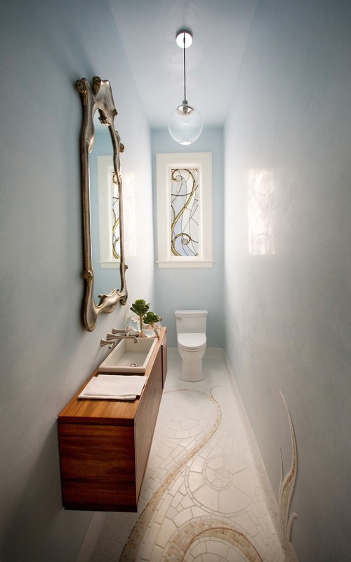
Homeowners were sensitive to their beach house’s existing architecture. Bubnowski integrated the beach by specifying glass tile in a shade similar to sea glass while tying the new cabinetry into the home’s existing woodwork.
Sam Oberter Photography LLC


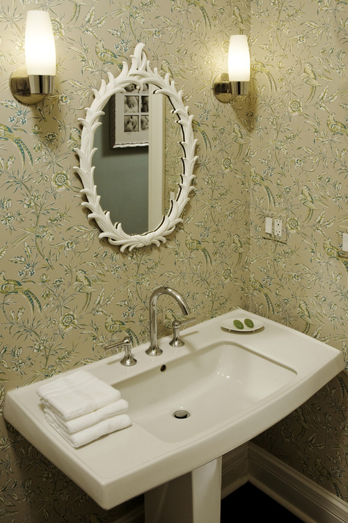
Trends from Joe Cracco
President of Modern Yankee Builders, Cumberland, R.I.
Bronze Winner in the 2010 Master Design Awards’ Bathrooms Under $30,000 category
  • Granite edging out glass countertops and soapstone
  • Vessel and semi-recessed sinks
  • Dark cabinetry and wood floors in bathrooms
  • Bigger windows in bathrooms
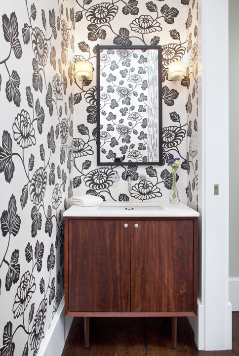
This project had a tight budget yet needed a lot of structural work. Cracco minimized his time on the structural work, so he could provide the homeowners with the fixtures and finishes they wanted, including bamboo flooring.


Trends from Michael Tenhulzen, CGR, CAPS
President of Tenhulzen Remodeling Inc., Redmond, Wash.
Gold Winner in the 2010 Master Design Awards’ Kitchens Between $50,000 to $100,000 category
  • Lighter wood or painted cabinets and contrasting colors
  • Less green, more aesthetic or functional pieces
  • Upper-middle-range appliances and plumbing fixtures
Tenhulzen says the desire to make the kitchen a multipurpose room actually has brought office niches back into kitchens.
Scott Chytil Photography


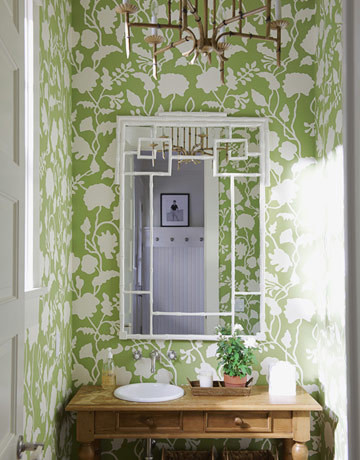
Trends from Mark Evans
Project designer with CG&S Design/Build, Austin, Texas
Silver Winner in the 2010 Master Design Awards’ Bathrooms Under $30,000 category
  • More natural stone and less color
  • Marble and limestone instead of granite in bathrooms
  • Patinated finishes
Evans is seeing less color in remodeling projects; if homeowners want color, it is added with materials.

Thursday, April 7, 2011

The New Home in 2015

The NAHB (National Association of Home Builders) is out with a new study that looks at the coming trends in home design and home building:

The current housing downturn has affected not only the number of new homes that are built each year, but also the characteristics, features, and size of the ones that do get built. Many in the industry are wondering about how the new home will evolve over the next few years and whether those changes will stick once the economy bounces back to a more solid footing. In 2010, NAHB conducted a survey that sheds light on the likely characteristics of the average, new single-family detached home in 2015. This article summarizes the findings of that survey, which were released in December 2010 in a report titled The New Home in 2015 [1]  . Some of the most relevant findings include:

  • The average, new single-family home will be smaller and have more green features
  • The living room will either vanish or merge with other spaces in the home
  • The “Great Room” is the likeliest room to be included in the average new home
  • Low-e windows and engineered wood products are the likeliest green features
  • A double sink, recessed lighting, and table space for eating are very likely in kitchens
Read the Full Report  


There are some interesting items that were uncovered in their study. It's probably no surprise that average home sizes are expected to shrink in the coming years. Smaller footprints generally mean less storage space. If that's the case, then it will be more important than ever to maximize the scarce storage that does exist. A good closet system can go a long way to add storage without adding square footage. You'll be amazed at the additional storage you can achieve without adding much additional cost.

Saturday, April 2, 2011

The Real Fisticuffs in Florida are Over Commercial Interior Design

Forget the drama in Wisconsin over unions. There's a real battle brewing in Florida over Interior Design Licensing. What do you think - does licensing interior designers qualify as necessary in this day and age? Speaking as a licensed interior designer myself, I'm not sure if it does. Take a look at this article form today's Bradenton Herald and see what you think.


The real fisticuffs in Florida are over commercial interior design - Politics - BradentonHerald.com

Tuesday, March 29, 2011

Mini Remodeling Trends

Received this from Kitchen & Bath Design News. Thought it was interesting: 

'Mini Remodel' Trend Highlights Decorative & Functional Hardware

As cautious consumers look to spruce up their homes without breaking the bank, mini remodels are becoming increasingly common. Decorative and functional hardware can play a key role in these jobs, as it can provide an updated look and better functionality while giving consumers plenty of "bang for the buck."

Decorative hardware allows for greater personalization, whether the preference is for coordinated hardware throughout the home or unique designs that speak to the homeowners' tastes, interests and passions. Bolder, larger pulls and knobs are hot, with clean lines and linear designs all the rage right now. In functional hardware, quiet-close features, door dampers, slides that accommodate large drawers and lifter mechanisms are in high demand.

Below are some of the hottest trends in decorative and functional hardware.
  • In decorative hardware, transitional styling remains a strong trend, as it works in a broad array of environments and doesn't get dated easily, making it a "safe" choice.
  • Dovetailing the trend toward greater simplicity in design, decorative hardware lines are cleaner and more linear, with less ornate detailing. But less ornate doesn't mean unobtrusive: Bold is in right now, with larger bar pulls, appliance pulls and oversized knobs being used to make a design statement.
  • At the ultra high end, traditional still holds strong appeal, with some seeing a revival in French and early Italian period hardware, as well as requests for special finishes such as two tones and patinas.
  • There is continued interest in formal finishes such as polished chrome and polished nickel, while stainless steel, satin nickel and satin chrome are popular for their ability to coordinate well with popular fixtures and appliances.
  • Functional hardware is increasingly being seen as a design element, not just an afterthought, with growing demand for advanced closing technologies, such as self-closing drawer slides and door dampers that eliminate the noise associated with cabinet door slamming.
  • With an aging population, hardware that enhances accessibility, such as lifter mechanisms, is becoming increasingly popular. 
 

You can always have free samples sent to you from Top Knobs USA. Or stop by our showroom to see a wide selection of hardware choices to start your mini-remodel!